Sunday, November 20, 2011

Suicide Slum Comix: Simon and Kirby's Subversive Comics About Comics

Comics are inherently playful. They can stretch time out thousands of years -- or compress 100 years into a small box. Comics' potential for playfulness is still largely untested. Looking over the extant history of the comic book, in particular, one is struck by how rarely its creators cut loose with their own medium.

Comics are hard work. From writing to penciling to inking, it's a long haul, and often a solitary slog. No matter how savvy an artist or writer may be, the inescapable task remains. A blank page must be filled with words and images. The words take much thought to write; the images take much longer to design, sketch and render. If those images are to be printed in color, the artist (or another talented person) has to choose and apply the colors. That, too, requires much time and thought.

Comics-making can be joyless work--although the endgoal is to please and captivate the reader.

The consumption of comics can be joyous, if the work itself satisfies--or confounds--reader expectations. Without a lot of hard, high-focus work, the stories themselves, good, bad or so-so, wouldn't exist for us to snarf down. As Dan Nadel sagely notes in his introductory text to the book Art In Time:


"A worthy story... is always the difficulty of comics."

Thus, mainstream Golden and Silver Age comics about the act of making comics were seldom too playful. It's as if all the hard work of creating comics--the unavoidable writing and drawing, the late-nighters and tense deadline hauls--has made them a sacred cow.

Modern comics have embraced autobiography--from the pioneering efforts of Justin Green, Robert Crumb and Harvey Pekar to modern practitioners such as Joe Matt, Seth, and even Yoshiro Tatsumi. The comic book that has received the most critical praise and attention, Art Spiegelman's Maus, is, in part, an autobiography--which includes scenes of the act of making comics. (Spiegelman's recent MetaMaus takes this duality even further.)

A medium as reflective, and as malleable, as comics begs for a playful attitude--in both creators and consumers. Comics about comics (CaCs) have the potential to unleash an antic side of its creators' psyches. Why, then, were so many earlier comics-on-comics so self-deprecating--and so unrevealing of the true nature of making comics? Is this a reflection of the low status of the comic-book artist?

Take, for example "Cartoonist's Calamity," the nightmarish Bill Everett saga of a cartoonist's world that appeared in Timely-Atlas' Venus #17 (Dec. 1951).

Jimmy Rogers, the harried protagonist of this story, is one stressed-out soul, at once alienated and alienating to others. The pressures of his job as cartoon editor of Beauty magazine (the home base of the Venus universe) have turned him into a hostile, sunken-eyed abuser. (To read this Everett gem, see our earlier posting here.


Speaking of Kalamities, there's the klassic E.C. fillip, "Kamen's Kalamity" (Tales From The Crypt #31- Aug/Sept 1952). E. C. published many CaC stories. They are all about the creators, and not their creations. In "Kalamity," William Gaines, Al Feldstein and Kamen, portrayed as a gentle, affable bad joke-loving goofus, appear in an in-jokey story that parodies the tropes of the E. C. horror stories while also catering to them. 
 Jack Kamen, as pictured in his E. C. comics profile feature


Two excerpts from "Kamen's Kalamity," showing Gaines, Feldstein and artist Kamen


Whimsical though these E. C. CaC stories are, they reveal nothing about the actual process of creating comics. The character sketches of Gaines and Feldstein, as hyperbolic worry-warts in search of a story gimmick, are amusing, but they don't offer a real picture of their work process. As can be seen by Kamen's publicity picture above, the E. C. staff were working stiffs, sleeves rolled up, cigarettes smoldering in a nearby ashtray, and butts numb from hours in front of the drawing board. The E. C. creators lavished remarkable visual--and verbal--detail on their stories. These were not laugh-happy playboys, dashing off comics stories in a festive mode. 


One of the forgotten, longest-running CaC series was Quality Comics' Pen Miller, an Ellery Queen flavored riposte about a crime-solving cartoonist, The feature ran for almost all of the 1940s in National Comics and then Crack Comics. Again, the profession of a cartoonist/comic book creator takes a back seat to something much more glamorous. The talented Klaus Nordling penned Pen. 


Curiously Miller's cartoon style looks exactly like Nordling's. To our knowledge, Nordling never actually portrayed himself in his own CaCs. You can read several examples of "Pen Miller" here.


A considerably more autobiographical, and winning treatment of the profession of cartooning occurs in Sheldon Mayer's baby, Scribbly. This feature was even longer-running, starting in the proto-comics of the mid-1930s and lasting into the early 1950s. Like almost all of the early CaC stories, Scribbly is short on the details of the art of creating comics, but it does go a long way towards sharing the sheer love of making comics.


Here's a sequence from the series' early years that shows Mayer's CaC feature was solidly about the adventure of being a cartoonist more than the reality.


Another comics master who put a version of himself into his stories was Jack Cole. Starting in his earliest stories, he also captured the sheer joy of comics -- as if imagining a super-hero into existence was the sames as making him real.


Sadly, Cole -- like nearly everyone in the early years -- tended to portray himself as a goofus. In an early Plastic Man story, he's a stuttering, small-minded hick:


Cole also created two little-known stories featuring a character called Inkie; a sort of "Out of the Inkwell" cartoon come to life. This was part of a long-running series at Quality, but Cole's stories are standouts. Here's one:


Learn more about Jack Cole's self-referential comics at Paul Tumey's blog.

So far, we've exclusively discussed CaCs about cartoonists and their lives in front of--and away from--the drawing board. There is a variant CaC story, seen less often, that is far more creative, self-aware and revealing. In these story, the characters--not the creators--create the content of the stories themselves, as we observe them at work.

In these stories, the work is not polished professional stuff--it's deliberately crude, raucous and rebellious of the craft of comics. Ironically, these stories give us more of the heart and soul of their creators--which makes their relative scarcity truly regrettable.

John Stanley created one of the best-known examples of this CaC variant for his best-selling comic book Marge's Little Lulu. When Lulu became a regular Dell Comics series, in 1948, Stanley created a two-page text feature called "Lulus Diry." Laden with typos, X-ed out words, run-on sentences and malapropisms, Stanley's early "Diry"s featured "picturs by Lulu too"--ramshackle, sublimely childish scrawls that reveal aspects of the Lulu Moppet character that her own stories, by their objective viewpoint, could not show us. This allows us to see the character from the inside-out, in a way that most comic book stories never can.

Here is the second "Lulus Diry," from 1948:


The use of speech balloons, and occasional sound effects, marks "Lulus Diry" as a type of comics. The feature quickly lost its ramshackle look and feel, but continued through Stanley's tenure on the Little Lulu title. You can read more about "Lulus Diry" here at Frank's blog, Stanley Stories.

Before "Lulus Diry," one of the dream teams of Golden Age comics had pioneered this approach. Joe Simon and Jack Kirby, while at DC Comics in the early 1940s, brought tremendous energy and charm to a comics imprint more known for its bland, polished product. In and of themselves, the Simon-Kirby work for DC expresses the love of creating comics. Their panels burst with energy and attitude, and their pages defy the orderly grids of Superman and Batman.

In one of their last stories for DC, Simon and  Kirby directly reference the making of comics, from the flawed hands of their own characters, in a single story that shows a path comic books might have taken, but seldom did until the age of autobiographical comics.

"Cabbages and Comics," from Star-Spangled Comics #29 (Feb. 1944), combines the rowdy, Warner Brothers-like atmosphere of the Simon-Kirby comics world with a berserk attack on the law and order of the comic book field, circa 1944. Joe Simon's inking seems a bit berserk, itself, on the first few pages of the story, but as it continues, we see a prime example of the Simon-Kirby team at the top of their game.

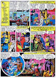
In this story, the kids of the Newsboy Legion decide to create their own, hand-drawn comic book for their neighborhood of Suicide Slum. Talk about a labor of love! Each edition Suicide Slum Comics is individually hand-crafted by the Legion--in a remarkable anticipation of the DYI mini-comix movement that began in the 1970s.

There's nothing remotely like this elsewhere in the history of early comic books. Before we show you the story, please take a moment to savor this highly subversive burst of raw energy...


Each panel is drawn (and signed) by a member of the Newsboy Legion. Like "Lulus Diry," these intentionally primitive drawings reveal something about the consciousness of the characters. For example, the garrulous Gabby can only draw stick figures:


Big Words' frames betray his significant, erudite vocabulary, and a rudimentary understanding of foreshortening--which, in turn, reveals the hand of Jack Kirby, with a sly wink:


Scrapper's take on comics anticipates Gary Panter by four decades:


And now, here is "Cabbages and Comics," including its cover image, for yez readin' enjerment...


"Cabbages and Comics" emerges from a void which immediately sealed itself for several decades. American comic-book creators, prior to the autobiographical pioneers, seemed to assume that their profession was too lowly to portray realistically. Nor were they comfortable enough to approach their trade with such lunacy as Simon and Kirby--who themselves, in the mid-1940s, reached a level of self-confidence (and star status) that few of their peers attained.

This is by no means an exhaustive survey of Comics about Comics. We feel there is much more to be said on this topic. We hope that, by opening up a dialogue on this seldom-discussed byroad of comics, we can encourage others to contribute to a deeper understanding and appreciation of this flexible, playful and reflective art form.


--Paul Tumey and Frank M. Young, 2011


P.S.: Alter Ego #105 features an abridged, full-color version of our premiere Comic Book Attic article. Look, Ma, we're in print! You can buy the paper or digital version of this new issue here.

Saturday, May 28, 2011

JIMMY THOMPSON - The Greatest Comic Book Artist You Never Heard Of: The Timely Stories 1943-47

ONLY 2.99
Jimmy Thompson's ROBOTMAN Volume 1
A 159-page ebook of terrific reading, curated by Frank Young. Jimmy Thompson's first 20 Robotman stories, lovingly restored and annotated, with FREE bonus section of INDIAN LORE, Thompson's long-lost mind-blowing American Indian epic.


Please note: Orders filled within 24 hours. Because this file is large, it is necessary for me to email you the file myself in order to avoid costly storage and data transfer charges. This keeps the price very low for you, but please be patient as I will need to check email and fill orders manually. Thanks a million for supporting this blog!


Jimmy Thompson was perhaps the greatest stylist in 1940s comic books, although almost nobody realizes it today.

Although he was a prolific and consistently high-quality creator, he never invented a hit superstar character, such as Will Eisner did with THE SPIRIT, or Jack Cole accomplished with PLASTIC MAN.

In 1938, when he embarked on his comic book career sometime in his 30s or 40s, Thompson was already a far more accomplished draftsman and commercial artist than most of his contemporaries in the business.  Many early comic book artists were teens learning how to draw and still living at home. Thompson already had a wealth of experience ghosting newspaper comics, such as Roy Powers, Eagle Scout and Hairsbreadth Harry, and creating impressive commercial illustrations. He was a rare case of an artist coming into comic books from newspapers and syndicated strips. The dreams of most struggling comic book artists of the time were to go in the opposite direction!

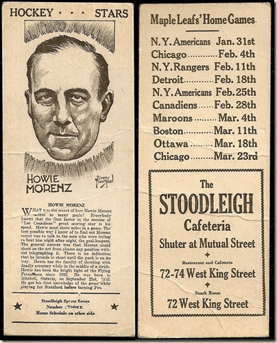
stoodleighs
As seen in this rare sports cartoon (above), circa 1933, Thompson had great drawing chops when Will Eisner was still popping pimples.


This raises the comic book mystery: why did Jimmy Thompson – an established, successful artist –  pursue a career in comic books? It could only have been for the money!

Thompson’s first comic book stories appear in David McKay’s King Comics and Magic Comics– the only original material in titles which otherwise reprinted King Features syndicated material such as MANDRAKE THE MAGICIAN and HENRY.  These stories are tales of American Indians that Ron Goulart called “ the best Indian stories in comic book history.” Unlike the majority of the stampede of western comics that appeared ten years later, Thompson’s stories are all sensitive, informed stories told from the point of view of the Indians.

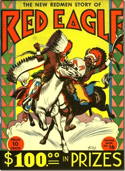
RedEagleCover

In 1938, at virtually the birth of comics, Thompson wrote and drew ‘Red Eagle,” a 76-page epic Indian story that comprised the entirety of Feature Book #16 (David McKay, 1938). This could be considered the first graphic novel. Obviously, David McKay was a huge Jimmy Thompson fan!

Thompson’s INDIAN LORE and RED MEN features (see this post at Easily Mused for a sample) ran until early 1943, when he abruptly changed horses in mid-stream to jump on the super-hero bandwagon.
From 1943 to 1947, he created stunning hero comic book stories for Street and Smith, National (DC), and Timely (Marvel).

Robotman Star Spangled 26 Noc 1943  Captain America 034 (Timely 1944) 048.fiche
It was also highly unusual, at the time, for any comic book creator to work for BOTH Marvel and DC, which Thompson did from mid-1943 to late 1947 (he continued to work for DC until approximately 1949). Thompson also worked for Fawcett, the third emergent leader in comics at this time, although we have yet to identify any of his work for this company.

In an effort to position themselves in the market – and probably as a natural artistic development – both DC and Marvel developed vastly different house styles in the early 1940s. DC’s output offered polished artwork and storytelling. Marvel’s books in contrast were crude and chaotic. Yet, in some ways, Marvel’s books were more powerful. Jimmy Thompson’s style did not fit into either company’s “house” aesthetic, and yet he produced hundreds of pages for both companies!

Thompson’s work, like Basil Wolverton’s, is stylistically unique and recognizable from a mile away.
Jim Steranko raved about Jimmy Thompson in his 1970 book, The Steranko History of Comics Volume 1. Steranko – an accomplished stylist himself – wrote that Jimmy Thompson’s style looked like:
“a combination of Jack Cole and Will Eisner.”
As if that were not high praise enough, Steranko goes on to say,
“In fact, some of Thompson’s work topped theirs.”
Like Jack Cole, his counterpart at Quality, Jimmy Thompson was his own one-man comic book packager, doing the penciling, inking, and lettering on the majority of his stories. Just as Jack Cole’s work has a highly distinctive look and feel, so does Thompson.
Sub-Mariner_014_Fall 1944 Robotman Star Spangled 45 June 45

Steranko writes that “his technique was backed by good solid drawing, rendered cleanly and precisely.” Beyond his expert draftsmanship, Thompson was, in our opinion, second only to Cole and Eisner in his ability to design stunning page layouts and seamless panel sequences.

Robotman Star Spangled 36 Sept 44

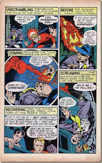
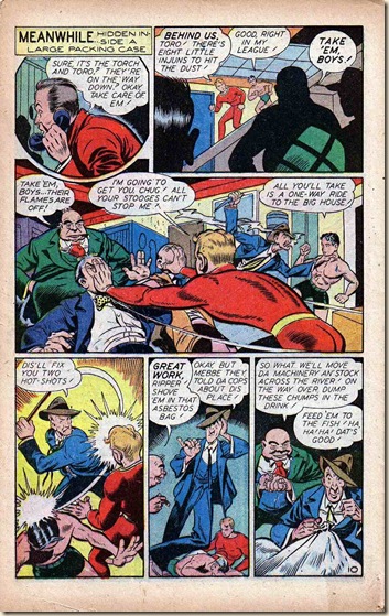
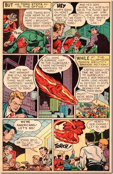
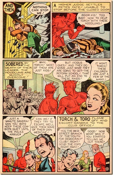
Sadly, unlike Cole and Eisner, who enjoyed success and recognition, Thompson’s work, after he left David McKay, never transcended the back-up stories level for DC and Timely. At DC he was often forced to create cramped 4-6 page stories that rushed by breathlessly. Timely's back-up stories were often longer than DC’s–one of the many ways the companies differentiated themselves. Thompson’s Timely work  sometimes spread out to 12 pages. As well, Thompson was given the chance to draw stories featuring major characters, such as in this beautifully designed and rendered HUMAN TORCH story from Timely’s All Select #9 (Fall 1945):

 All_Select_09_15 All_Select_09_16 All_Select_09_17 All_Select_09_18 All_Select_09_19 All_Select_09_20 All_Select_09_21 All_Select_09_22 All_Select_09_23 All_Select_09_24 All_Select_09_25 All_Select_09_26

As is true for a lot of Thompson’s work for Timely, the artwork is probably better than the stories themselves (written by unidentified staffers) deserve. Thompson gives these stories his all. From sweeping, perfectly laid-out cityscapes to graphically compelling close-ups of real people with real personalities, Thompson’s stories demand the reader’s attention and respect.
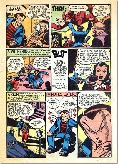
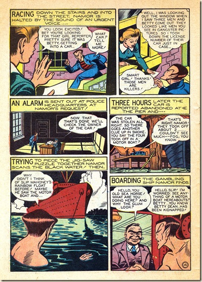
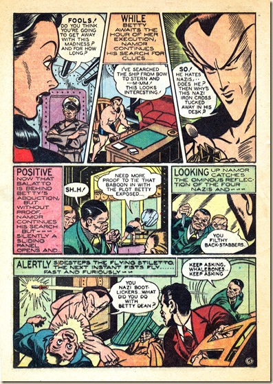
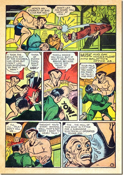
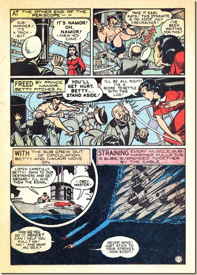
Thompson realized, as did Jack Cole and Will Eisner, that the text in comics has an artful dimension. He employs a brilliant mix of elegant typography (usually rendered with the same tool architects of the time used, a Leroy Lettering set) and hand-drawn colophons, sound effects and emphasized words. The effect is delightful eye-candy that propels the story forward. Check it out in this Sub-Mariner story from Marvel Mystery #54 (April, 1944)!

 marvel_mystery_comics_054_15 marvel_mystery_comics_054_16 marvel_mystery_comics_054_17 marvel_mystery_comics_054_18 marvel_mystery_comics_054_19 marvel_mystery_comics_054_20 marvel_mystery_comics_054_21 marvel_mystery_comics_054_22 marvel_mystery_comics_054_23 marvel_mystery_comics_054_24 marvel_mystery_comics_054_25
marvel_mystery_comics_054_26

As grim as this non-PC wartime story is, Thompson’s art delivers the typical Timely 12-page opus of Armageddon with unexpected humor and elegance.  For instance, consider the page 10 bitch-slap, or the stunningly drawn shipworks interior on page 8, top right.  It’s worth looking at this story a second time to savor its juicy visual tidbits (something many have wanted to do with Prince Namor, no doubt!). Even though Thompson did not write these – or most of his post-David-McKay work – his robust style makes him almost a co-writer, in many cases.

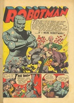
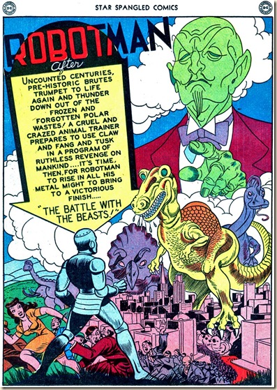
During the time that Thompson drew these top-tier, testosterone-driven Timely stories, he also drew the lighter, and more humorous ROBOTMAN for DC. (See Frank’s great series of articles and reprints on ROBOTMAN at Sherm Cohen’s blog, here.)

Robotman Star Spangled 37 Oct 44

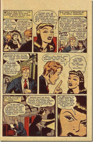
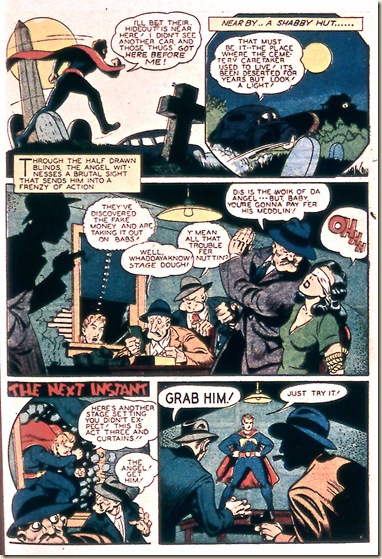
At Timely, Thompson’s ANGEL stories are perhaps the closest in feel to his ROBOTMAN work, with more emphasis on character and humor, and less on blowin’ up enemy subs! Thompson brings a kind of Errol Flynn panache mixed with screwball comedy to these stories.

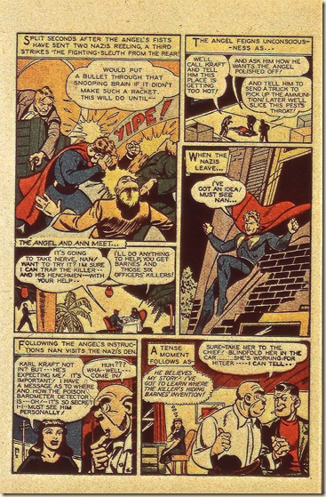
In “The Devil’s Imposter,” from Sub-Mariner #13 (Spring, 1944) Thompson starts out with a splash panel that gets funnier each time we look at it. The ANGEL barely notices the thug clinging to him, and doors seem to have no actual ability to restrain his heroic fun. Thompson’s manner of drawing this story takes a by-the-numbers Nazi crime story and turns in on its head, into a sly parody of super-heroes. (If you want to see Thompson draw a truly heroic figure, look at any of his Indian stories).

 Sub-Mariner Comics 013F 041 Sub-Mariner Comics 013F 042 Sub-Mariner Comics 013F 043 Sub-Mariner Comics 013F 044 Sub-Mariner Comics 013F 045 Sub-Mariner Comics 013F 046 Sub-Mariner Comics 013F 047
Sub-Mariner Comics 013F 048

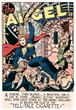
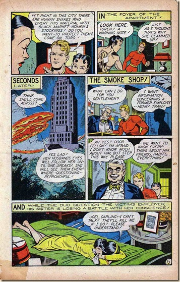
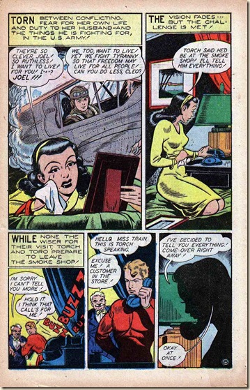
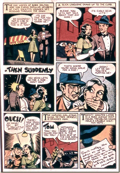
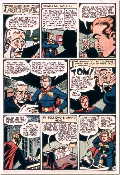
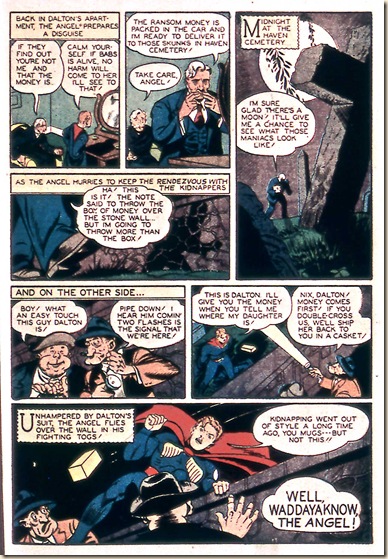
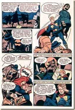
Next, here’s “The Tell-Tale Cigarette,” another ANGEL story, from the next issue of Sub-Mariner (#14, Summer 1944). This story is perhaps a better illustration of the fun Thompson had with this character.

 Sub-Mariner_014F_(Timely-1944)_42 Sub-Mariner_014F_(Timely-1944)_43 Sub-Mariner_014F_(Timely-1944)_44 Sub-Mariner_014F_(Timely-1944)_45 Sub-Mariner_014F_(Timely-1944)_46 Sub-Mariner_014F_(Timely-1944)_47 Sub-Mariner_014F_(Timely-1944)_48
Sub-Mariner_014F_(Timely-1944)_49

Page five of the above story is a strong example of the superior design Thompson brought into the infant form of comic book storytelling.
Sub-Mariner_014F_(Timely-1944)_46 Notice that he creates a sort of mirror on the page, where a short vertical stack of panels on the top left is reflected on the bottom right. On the other axis, he creates two open spaces void of background detail. This effect expertly highlights the action climax of the story. The poses of the characters dynamically mirror each other in opposite tension. In the top-right scenario action moves up, and in the bottom-left, figures push the energy downward.

Jimmy Thompson left Timely, it appears, around mid-to-late 1947, and mysteriously disappeared from comics after 1952.
The Comics Database lists Human Torch #28 (Fall 1947) as his last published work for Timely. We can only speculate on this career move. Perhaps a change in editors, location, personal situation… who knows? Thompson continued to work for National through 1950. He worked in comics a bit longer, creating non-genre pieces for Eastern Color’s titles New Heroic and Juke Box Comics and some westerns for Avon. Did Thompson pass away? Or did he, like so many other comic book masters of the time, such as Jack Cole, find a new career in another field?

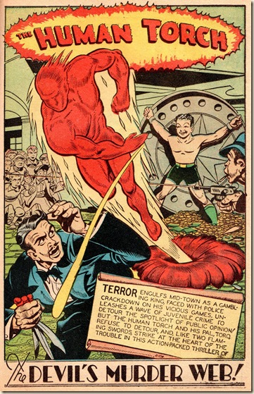
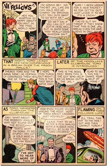
The mystery remains, but so does his work. We’ll close with a stunning (and nicely scanned – thank you, scanners!) HUMAN TORCH story from DARING COMICS #12 (Summer 1945). There is Daring Comics 12-035a stunning array of stylistic technique in this story. We’ll call out one, in particular, which we fondly label the “proscenium effect.”

On page five, the center panel calls attention to its central figures. Thompson places them front and center, as if they are on a stage and the reader has front row seats. This creates a delightful theatricality to the “performance” of the characters at a time when most comic book stories were influenced by the movies.  In fact, this is, in some ways, the perfect Jimmy Thompson page, with the jaw-dropping art deco cityscape in panel one, the antic exaggeration of the running figure in panel three, and Thompson’s masterful placement of speech balloons and typographical elements.


We hope to post more about Jimmy Thompson, whose work deserves to be much better known and appreciated. For now, enjoy “The Devil’s Murder-Web!”
- Frank M. Young, Paul C. Tumey, and Mortimer

Daring Comics 12-031 Daring Comics 12-032 Daring Comics 12-033 Daring Comics 12-034 Daring Comics 12-035 Daring Comics 12-036 Daring Comics 12-037 Daring Comics 12-038 Daring Comics 12-039 Daring Comics 12-040 Daring Comics 12-041
Daring Comics 12-042
All text copyright 2011 Frank M. Young  and Paul C. Tumey